


A) What did I attempt to create and communicate?
Two of my t-shirt concpets were awareness logos ("Pray For Japan" & "The Whistler 100").
Japan because of the recent magnitude 9.0 (on the richter scale) earthquake [Link]
The backround for the Pray for Japan concept is the Rising Sun, Japan's national symbol.
The Whistler 100 because of the heart-breaking exicution-style slaughter of over 100 of Outdoor Adventures Whistler's sled dogs. [Link1] [Link2]
The paw print on the Whistler 100 concept is supposed to looks like a bloody pawprint in the snow.
Oh, and LOST just because it's my favourite show of all time, i wasn't really trying to communicate anything. As for the numbers, if you watched LOST you'd get it. haha
Edit (07/05/11)-- Added "Operation Anchorage" logos, which i used for my actual shirt (Pics of which i will post later). 'Operation Anchorage' is a fictional historical event from the game Fallout 3, in which you annex the Chinese Comunist Invades from Anchorage Alaska. [Link]
B) What difficulties did I encounter?
None really. Brainstorming ideas that could be silk screened i guess.
C) What did like about the project?
Getting to make awareness shirts. <3
Edit:: And spreading my love of Fallout 3. <3
BUTTONS::
AFI::


The Academy Is... ::


RANDOM::


PNG Buttons:


Personal Critique::
A) What did i attempt to create and communicate?
I really didn't attempt to communicate anything, all these were just random things i liked. As for creation, well.... They're buttons, i can't say much other than that.
B) What difficulties did i encounter?
Sizing was the worst, and coming up with concepts. Also, trying to figure out how to make them post without a white backround... Obviously i was unsuccessful.
Also, the Enclave [Link] [Link2] [Link3] ( (C) Fallout 3; Bethesda) was a huge pain in the arse to do. >__<
C) What did i like about the project?
I liked the finished product, particularly the "The Academy Is..." buttons. It was fun experimenting with different edits too.
I'll post links to my refferences, and original photos as soon as i find them.
Properties::
Heartless & Sora both to "Kingdom Heart" -- Disney & Square Enix
Lupin belongs to "Inubaka: Crazy For Dogs" by Yukiya Sakuragi
"I Can't Believe It's Not Butter" is a copyrighted product belonging to Unilever (Parent Company).
Isaiah Mustafa works for "Old Spice" :D
The Rising Sun is Japan's National Flag.
Both The Academy Is... and AFI are bands.
Kawaii is Japanese for "Cute!" :3
------------------------------------------------------------------


Soft Drink Label::
Reads:
Brand Name: [Ai Cola]
(Note:: Ai is the Japanese word for 'Love', the symbol in the center of the heart is the Japanese Kanji symbol for Love)
Flavour: Happiness Flavour.
Ingredients: Caffeine, Sugar, More Caffeine, Addictive Ingredients, Happiness, Magic, The Dreams of Small Children, Starlight, and More Caffeine!
Parent Company: BOS Drinks - Japan {like 7UP is a subsidiary Pepsi} (Note: BOS is the Brotherhood of Steel [Fallout 3/Fallout: New Vegas], and both the symbol used, and BOS do not belong to me. BOS belongs to Bethesda. I just liked the symbol. . . . )
Health Note: This is not a significant sourse of anything even remotely healthy, and unless you have the money to suppost a new addiction, we at Ai-Cola do not advise consumption of this product under any circumstances.
Another warning, the can/bottle states "No Refunds"
PERSONAL CRITIQUE ::
A) What did i attempt to create and communicate?
I attempted to create a nifty looking soft drink label, and as for communication, i wanted to make a point (though in no way a negative point, simply a point) that Japan does many things "over the top" (Example; Heated toilet seats, or Square watermelons). Hence, my drink is very "over the top", it has mass amounts of sugar, caffeine, and calories.
B) What difficulties did i encounter?
Finding suitable pictures/graphics, coming up with creative names, and details. Photoshopping it was a pain too, the Nutritional Facts was the worst to do. Oh, and trying to cram everything onto the label, while making it look good, and finding fonts that suited a soft drink label, while still making it look unique.
C) What did i like about the projects?
It was fun, and i like the finished product. It was a nice oppertunity to do something creative.
------------------------------------------------
 |
| Magazine Cover Project. Magazine Concept on "Warrior Cats Rule The Wild RolePlay" Created: Jun 30 2009, 3:00 PM EDT Link:: [http://warriorcatsrulethewildroleplay.wetpaint.com/] Original Photo credit to Cassia Heatley (dA:: [http://cassiaheatley.deviantart.com/] ) Texts:: Courier (T1) Eutemia l Felix Titling High Tower Text Vtks Revolt Bleeding Cowboys and Century Gothic Sizing:: 8x12in Editted on:: Photoshop Elements 2.0 {Personal Critique} :: A) What did I attempt to create and communicate? : I attempted to create a realistic magazine cover for my site [warriorcatsrulethewildroleplay.wetpaint.com], as for communication, i just tried to portray something you might see for a real magazine cover. B) What difficutlies did I encounter? : None really, some basic planning, and trying to work a good layout, otherwise it was pretty simple, and straightforward. I suppose choosing the right texts for it was a bit of a difficulty too, though certainly not insumountable. C) What do i like about the project? : I loved everything about this project! From selcting the picture, to selecting the text, and making a layout. This is definatly my favourtire project so far, by far. I love how my finished product turned out, and all that too. Constructive Criticism would be much appreciate! |
------------------------------------------------

Bean Board concept, i never got a chance to paint an actual Bean Board, but i figured I'd post my concept anyways.
This picture shows both my ideas; a cute food version, and a kawaii manga-style food version.
{PERSONAL CRITIQUE} ::
A) What did I attempt to create & communicate?:
I attempted to create a sort of cute-kawaii cafe theme. As for communication, i suppose it was supposed to convey a sort of happy-warm-and-fuzzy ambiance.
B) What difficulties did i encounter?:
I didn't get started right away, so i was at a bit of a rush when the deadline came, and i didn't get to make an actual board. :/
C) What did i like about the project? :
It was fun to draw, & it would have been fun to paint. I enjoyed coming up with the concept too.
-----------------------------------------------------
 |
| My Logo concept. :: Product Name:: 'Zombi-way' Slogan:: "When the Apocolypse comes, will you be ready?!" Because no one wants to be stuck in the middle of the Zombie Armageddon with no anti-zombie spray! So protect you delicious flesh, and buy 'Zombi-way' today! {Personal Critique} :: A) What did I attempt to create and communicate? : I tried to create a nifty logo for an anti-zombie spray. As for communication, I guess i was trying to communicate that zombies are dangerous, and you need this product to get rid of/save yourself from them. B) What difficulties did I encounter? : One major difficulty I encountered was drawing the actual picture on PAINT, my hand isn't the steadiest, especially when it comes to drawing with a mouse. C) What do I like about the project? : I really enjoyed coming up with the concept, because zombies are seriously amazing, and I like how the finished product turned out, for the most part anyways. Made on PAINT, and Paint.Net. |
--------------------------------------------------------------
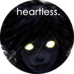
 |
Negative Space prject. I didn't like how my original one turned out, so i did something completely different. Drawn on plain lined paper, and colored with a black sharpy. |
{Personal Critique} ::
A) What did attempt to create & communicate? :
I attempted to create a guy with black hair, wearing a parka, using only negative space. I don't really think i was trying to communicate anything specific, i just thought it would look cool. . .
B) What difficulties did i encounter? :
Making the picture look right was a big pain, as well as coloring it in without going over any lines, or making it look blocky, or to round was also difficult. As well as making a concept that looked intresting.
C) What do I like about the project? :
I really liked how the end product turned out. And it was fun playing with a different sort of concept.